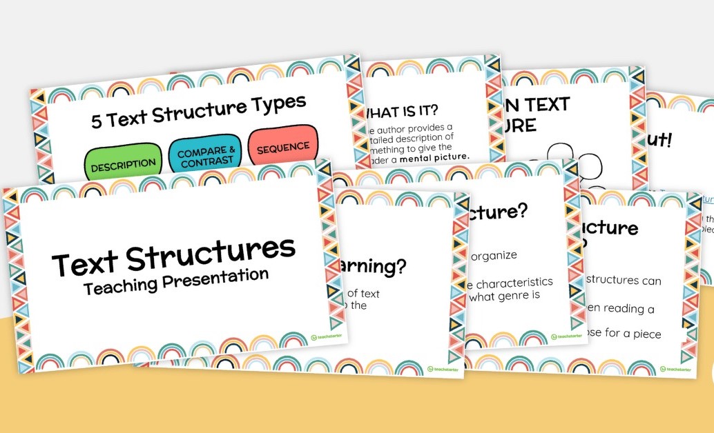
Understanding the Intricacies of Text Structures in a Slide Deck
The world of writing is not just about stringing words together; it’s about building and shaping information so that readers can understand and engage with it effectively. This is where text structures come into play, providing a framework for writers to organize their content. When we transfer such writing into a visual format like a slide deck, understanding these structures becomes even more crucial.
A slide deck dedicated to text structures would dissect the various patterns of organization used in writing. These structures include but are not limited to sequence, description, cause and effect, compare and contrast, problem and solution, and order of importance. Each structure serves a different purpose and can dramatically alter the way information is received.
For example, a sequence structure lays out information in a chronological order or as steps in a process. A slide on this structure might use timelines or flowcharts to represent the sequence visually, making it easier for the viewer to follow along.
Descriptive text structure focuses on painting a picture in the reader’s mind, often utilizing sensory details. In a slide deck, this might be demonstrated through image-rich slides that complement the detailed descriptions provided in the speaker notes or accompanying text.
Cause and effect structures pinpoint relationships between events—what happened and why it happened. Slides tackling this structure could benefit from diagrams that link causes with their subsequent effects clearly illustrating their interconnections.
The compare and contrast structure evaluates similarities and differences between two or more subjects. A Venn diagram would be an excellent visual tool in a slide deck to show this in an instantly understandable way.
Problem and solution texts present an issue followed by one or more solutions. Here, slides could be divided into two parts: one for the problem with sufficient context and imagery, and another showcasing proposed solutions with bullet points or illustrations.
Lastly, an order of importance structure might either escalate (climax pattern) or de-escalate (anticlimax pattern) in significance. For such a structure, slides might utilize lists or graphs prioritizing points by their level of importance.
Incorporating these text structures into high-quality slides ensures that your audience doesn’t only hear your message—they see it structured in a way that resonates best with them. This enhances comprehension and retention of material presented in educational settings or professional environments alike.
In conclusion, grasping various text structures is vital when creating an engaging slide deck presentation. By carefully choosing the appropriate structure for your content and complementing it with visual elements that enhance comprehension, you can deliver powerful presentations that educate and inspire your audience.


