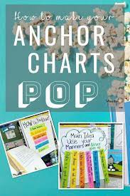
Anchor charts are essential tools in the classroom, helping to visualize learning and make concepts memorable. These large, handwritten posters can be powerful references for students, but with a little creativity, they can transform from mere classroom decorations into engaging, interactive learning aids. To make your anchor charts truly pop, here’s what you can do:
1. Use Color Wisely: Color draws attention and can help organize information. Utilize different colors to highlight key terms, show contrasts, or categorize ideas. But remember, too many colors can be overwhelming—choose a palette and stick to it for consistency.
2. Embrace Visuals: Incorporate drawings, icons, or even real objects to create a visual connection with the content. Visual aids can make abstract ideas more concrete and easier to grasp.
3. Make It Interactive: Transform your anchor chart into a living document by using sticky notes for comments or questions. This allows the chart to evolve with the learning process and encourages student participation.
4. Keep It Legible: Despite your artistic touches, ensure that your handwriting is clear and large enough to be read from anywhere in the room. The effectiveness of an anchor chart hinges on its readability.
5. Organize Thoughtfully: How you arrange information can impact comprehension. Use flowcharts, bullets, or numbered lists to structure ideas logically.
6. Invoke Themes: Integrate themes related to your curriculum or current lessons to create a cohesive learning experience.
7. Encourage Personal Connection: Let students add their insights or examples to the chart. This promotes ownership of their learning experience.
8. Refresh Regularly: Keep your charts dynamic by updating them often with new information so they remain relevant and engaging.
By implementing these strategies, anchor charts will not only pop visually but also become pivotal assets in fostering an interactive and immersive learning environment.


